Hi again. In Part 1 I discussed the Brand Refresh, but In Part 2 of the We Are Wibble Refresh I will delve into the creation of our new website. From the initial concepts, and the many many changes they had, right through to the development stage.
Touching on the perils of redesigning a website for a company I have worked at for less than a year while being “diplomatic” about previous design choices prior to my arrival. Fundamentally, dealing with the harshest critics of all, myself (and my new colleagues).
Needless to say, you may have noticed a few changes around here. So I’ll guide you through how we all got here.
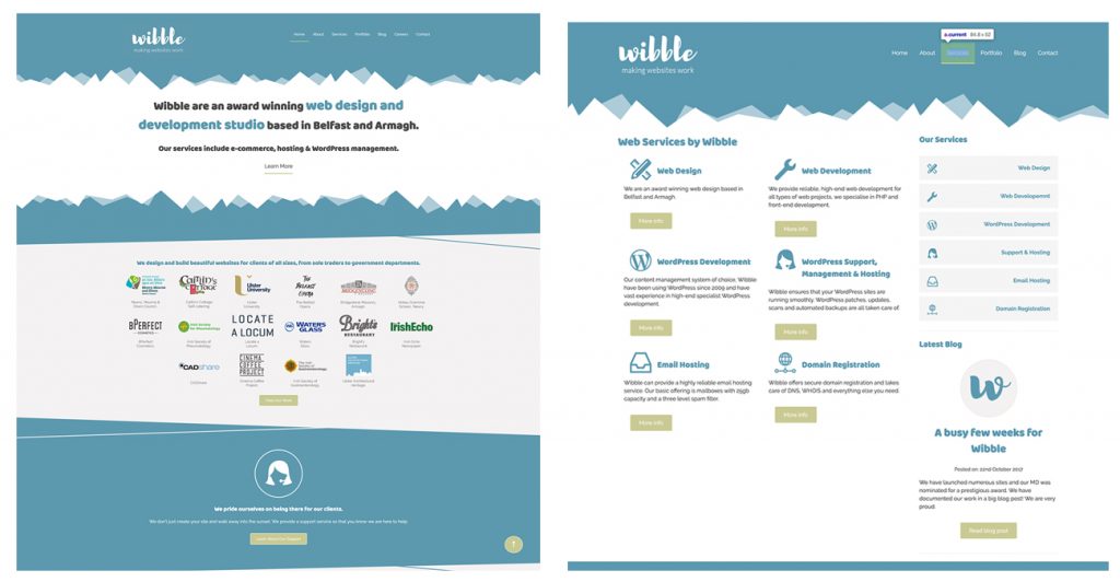
The previous website
Okay. I’m going to look at the previous design through the eyes of a potential client as I like my job. The previous design was fit for purpose but was very text-heavy. The imagery was missing from the home page. It also felt a little confused as more sections were added to the website. Basically, the website was great but like all things it needed a refresh and not all things can last forever.
When designing the new website I wanted to put more focus on the web design services and highlight our portfolio. The current website homepage did not feature the services or the portfolio apart from the navigation. I wanted to add much more imagery and make the website more dynamic. This is our main point of sale with clients so It needed to sell who we are in an instant.
Research & Sketches
First things first, Research. This is how I would start any project so it shouldn’t be any different when designing for Wibble. Looking at our competitors their online presence is focused each with their own USP (unique selling point). The websites that stood out the most were the sites with the most simple navigation. Getting anywhere in less than 3 clicks. This is the same rule that I would apply to any website I was designing for.
Wibble’s website had to be clear, concise, memorable, and with our own USP. Our brand would be reflected in the website and would follow that of our style guide. One single voice to carry through all of our marketing. Friendly, Corporate, and Approachable. It may read like a tinder profile but we believe in our message.
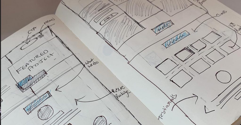
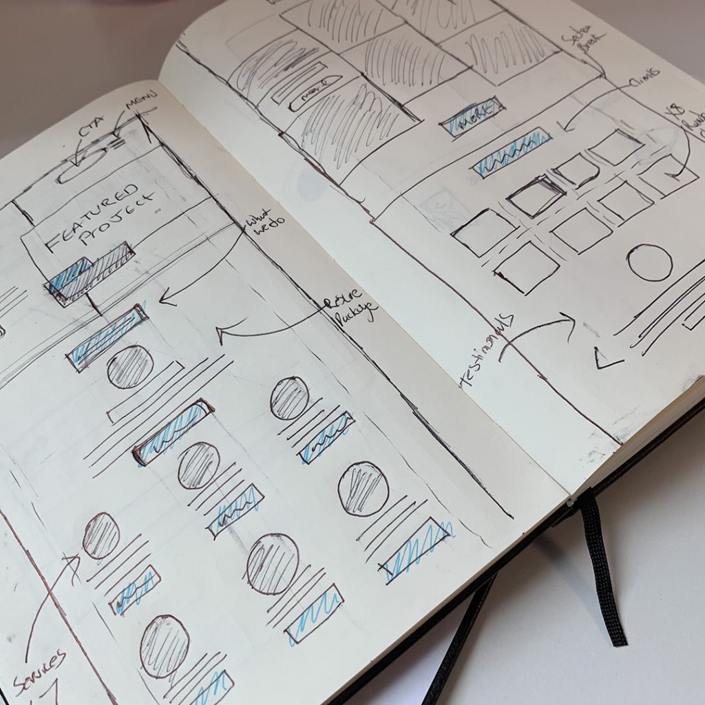
Sketches / Scamps / Ideas
Like any designer worth their weight, I began sketching a few ideas including ideas for iconography. Through the research, I found bespoke icons were a great way to push our companies message.
Bespoke Iconography sketches
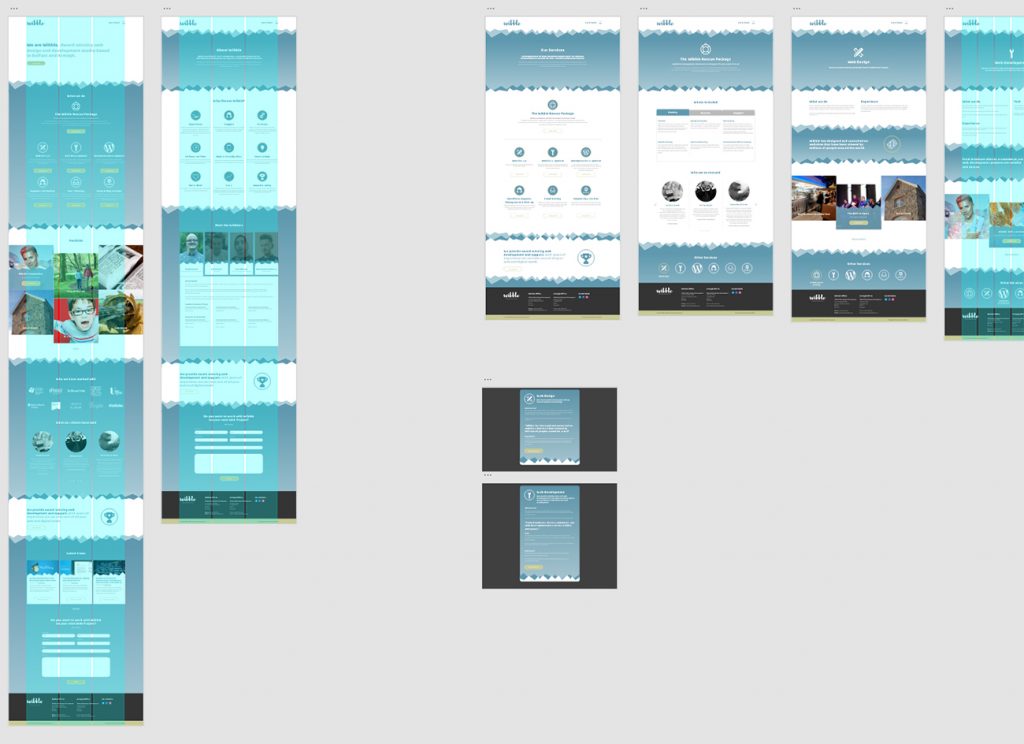
Concepts with Adobe XD
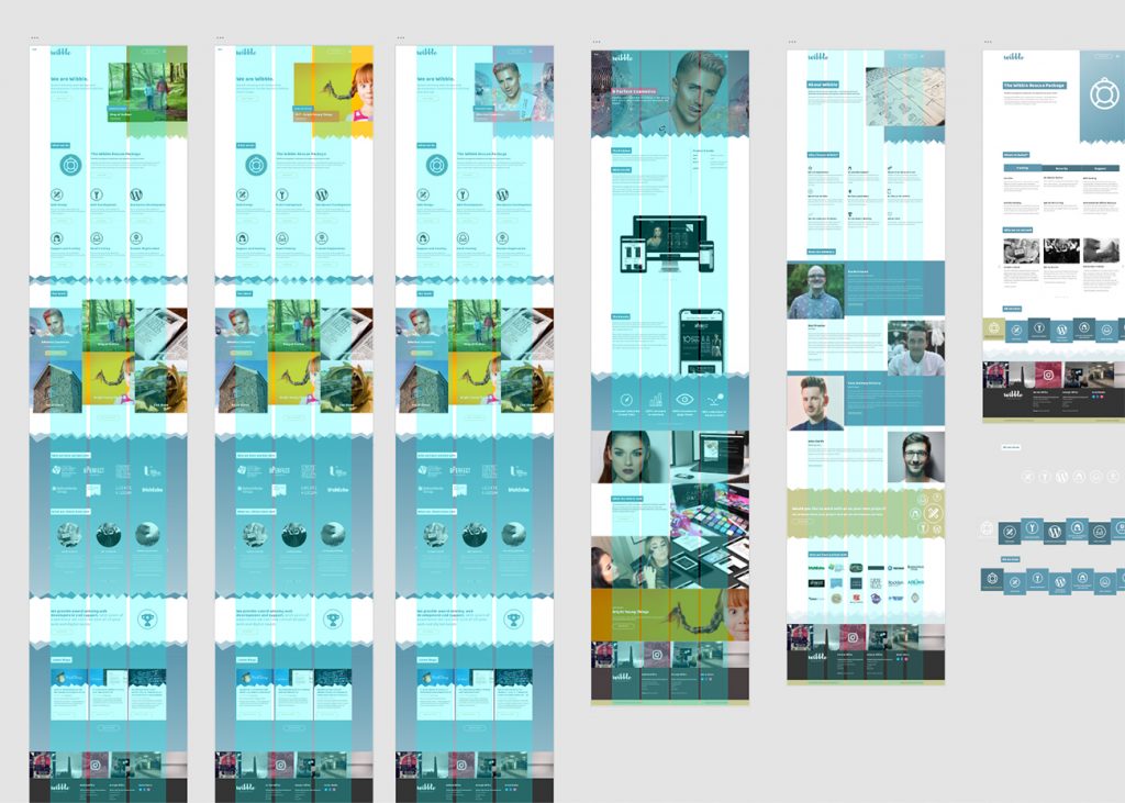
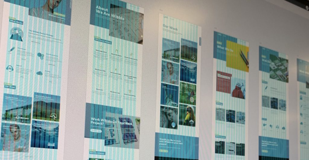
Once I had the outline for the website, including the sitemap, I began creating concepts within in Adobe XD. This is our go-to tool for all website concepts. It has streamlined the process of creating designs and sharing them with my colleagues, it was great for receiving comments and feedback from my fellow Wibblers, whether solicited or not. This stage was the most lengthy. As with any design, it can go through a few changes before a client has signed off (usually 3), but as this was for ourselves we all wanted the best, so naturally, a few extra changes occurred.
In the beginning, the concepts weren’t a massive departure from the original website. I was hesitant to stray too far, but after much debate, the concepts evolved and developed into something special. It’s fun to look back on the first few concepts and see elements that carried through to the final design.
Concept Version 1: Update to the original website but not enough of a leap in designConcept Version 2: More of a change but still not quite there. Still hanging on to design features from the original websiteConcept Version 3: Dropped “jaggys”. Stripped the website of clutter. Streamlined the homepage and services. Introduction of bespoke icons.
As previously stated, it is extremely difficult designing for yourself. You truly are your own worse critic. Nevertheless, we persevered and what we got at the end is a website that we can be proud of.
How it all came together
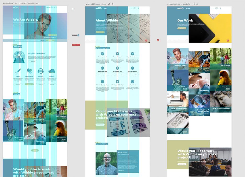
The previous website didn’t really shine any light on our body of work. This was solved by the new hero header on the homepage. Each reload of the page would feature a different web design project to highlight our previous work which we should be pushing and show some pride. This balanced the large headings and new buttons really showed a refreshing new feel to Wibble.
We simplified the menus by featuring a “burger” menu at all times, not just on mobile. Most people use the web via mobile devices so having a universal symbol throughout would eliminate confusion. We also introduced a “Start a Project” icon, which would link to a separate interactive section where a future client could contact us directly with their individual needs.
Pushing our services
Sales are important so the services are now directly below the fold. Bespoke Iconography was developed from my initial sketches. There are more detailed than the previous icons but are still very much Wibble. Hierarchy has been given to the “Wibble Rescue Package – a fully managed WordPress support service” as it is a unique service to Wibble and we want to push it more.
Our work is now heavily featured on the homepage and on its own page. Projects have also been completely redesigned with large imagery, icons, and quick information about each. CTAs (call to actions) are featured throughout the website. Services have also been redesigned and are now easier to find and split into more manageable sections.
We also now put more emphasis on web blogs, which has helped immensely with our ranking on Google, but also shows that Wibble is constantly interacting and updating.
In short, the entire website was redesigned and rebuilt from the ground up. It has given Wibble a thoroughly modern feel and has future-proofed it for at least 2 years. I Kid. I believe we’ve managed to keep the website very Wibble but made it much easier for clients, and ourselves to navigate and update.
Future Updates
Future updates to wearewibble.com
Like any company or website, we are constantly evolving. Our website has been up for a few months and we are updating bits here and there. They will be appearing in the next few months, but I’ve attached a little sneak peek above.
Soon we hope to have a system to onboard clients directly through the websites. Specifically The Wibble Rescue Package, with options for taking payments and securely receiving clients logins. This is currently in development and should be available in the next few months.
Coming in Part 3 – Branding Materials
The Brand has been refreshed, the website has been redesigned, but in Part 3, I will be looking at how we’ve implemented the Wibble Refresh with our internal and external documents, branded stationery, our social media, and those important business cards.