In web design and web development, the right choice of image file format can profoundly impact web performance, user experience and even your Google ranking and in other search engines. There are many file formats to consider and each has its unique use. Whether it is PNG for transparency and lossless quality, or JPEG for its versatile compression for extensive photographs galleries, each has its uses. In this guide, we will explore which is best for each eventuality you may need and also break down the jargon of compression, lossy and lossless images, RGB colour space and other terms that you may not be familiar with. We may also give you a few pub quiz answers that might help you win that bottle of house white.
The most popular picture file formats for web
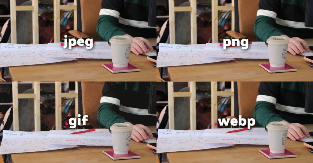
While not getting bogged down with the many, many different image formats we are going to focus on image format types for the web. Here are the primary picture formats commonly encountered when adding images to your website or social media accounts. While there are several more formats that are considered legacy or outdated, the following are the ones most frequently used:
GIF – Quick animations for sharing
Graphics Interchange Format (GIF) are the beloved pioneers of online animation in web design and are perfect for injecting life and humour into web content. With their ability to display short, looped animations, GIFs are often used for sharing memes, expressing reactions and enhancing storytelling. Their relatively small file sizes and wide support make them ideal for sharing on social media platforms and messaging apps.
JPEG – The OG and still the most popular
Joint Photographic Expert Group (JPEG) are the workhorse of image formats, striking a balance between image quality and file size. Widely used for photographs and complex images, JPEG compression allows for efficient storage and faster loading times on the web. This format is commonly employed in e-commerce websites, blogs and digital galleries, where image quality and web performance go hand in hand.
PNG – Giving lossless quality to an image
Portable Network Graphics (PNG) are the go-to when it comes to graphics requiring transparency or sharp edges. With lossless compression, PNG retains the highest quality, making it perfect for logos, icons and graphics with text. The ability to have transparent backgrounds allows for seamless integration into web designs, making PNGs popular among web designers and developers.
SVG – Scalability and Interactivity in the Web
Scalable Vector Graphics (SVG) are the superheroes of web graphics. As vector-based files, SVGs can be scaled infinitely without losing quality. This makes them ideal for responsive web design, where images need to adapt to different screen sizes. SVGs are often used for logos, icons, illustrations and their ability to incorporate interactivity makes them a powerful tool for engaging web experiences.
WebP – Efficiency for Fast Web Loading
Web Picture Format (WebP) is a relatively newer format developed by Google, offering both lossy and lossless compression. Its advanced compression algorithms result in smaller file sizes without significant loss of quality. WebP images load faster, improving web performance and reducing bandwidth consumption. This format is gaining popularity for web usage, particularly in areas where fast loading times are crucial, such as image-heavy websites and mobile applications.
Lottie Files – Interactive Animation for Engaging Web Experiences
Lottie files, based on JSON format, bring interactive animations to the web. With their support for vector graphics, motion paths and interactivity, Lottie files provide a seamless way to incorporate complex animations into websites and mobile apps. This format is widely used in interactive infographics, onboarding experiences and captivating storytelling, adding a touch of magic to web interactions.
Below is a quick go-to guide to keep you right on the different image formats and when to use them:
file
full name
extension
description
GIF
Graphics Interchange Format
.gif
A GIF is a short animated image or video clip. It loops continuously and is commonly used for sharing funny or expressive content online. It has a limited colour palette and can support transparency, making it compact and visually engaging.
JPEG
Joint Photographic Expert Group
.jpeg/.jpg
JPEG (Joint Photographic Experts Group) is a commonly used image file format that employs lossy compression. It is widely supported and ideal for storing photographs or complex images, offering a good balance between file size and image quality.
PNG
Portable Network Graphics
.png
PNG (Portable Network Graphics) is a popular image file format known for its lossless compression. It supports transparency and offers high-quality graphics suitable for web usage. PNG files are commonly used for images with sharp edges, text, or transparency needs.
SVG
Scalable Vector Graphics
.svg
SVG (Scalable Vector Graphics) is a file format for vector-based images. It uses XML to describe shapes, lines and colours, allowing for infinite scalability without loss of quality. SVG files are widely used for logos, icons and illustrations on the web.
WebP
Web Picture Format
.webp
WebP is a modern image file format developed by Google. It offers both lossless and lossy compression, resulting in smaller file sizes without significant loss of image quality. WebP files are widely used on the web to optimize loading speeds and save bandwidth.
Lottie
JSON-based animation filed
.json
Lottie file is a JSON-based animation format used for displaying complex and interactive animations in web and mobile applications. It provides a lightweight and efficient way to incorporate rich animations, supporting features like vector graphics and interactivity.
Lossless vs lossy image compression
Now that we got the main image formats out of the way it’s time to break down some of the terms used to describe each file type. Lossy and lossless are two different methods of image compression that have distinct effects on image quality and file size. Below we break down the differences between the two without the technical jargon.
Lossy Compression
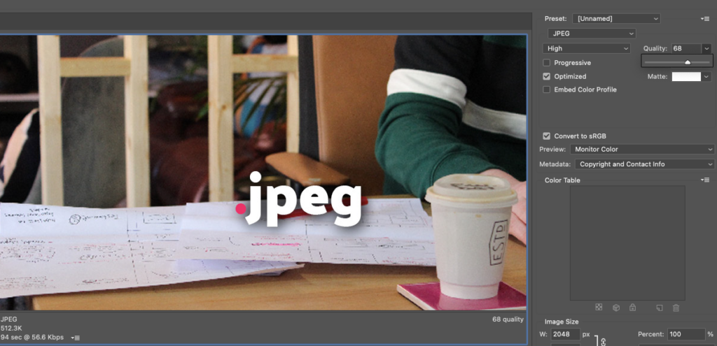
Lossy compression is a technique that reduces file size by permanently discarding certain image data. During the compression process, some information is discarded or simplified based on algorithms that prioritise removing less noticeable details. This results in a smaller file size but also a loss of image quality.
Screenshot of Photoshop changing the quality of a lossy JPEG image for export
Lossy compression is commonly used for formats like JPEG, where the degree of compression can be adjusted. Higher levels of compression lead to smaller file sizes but at the cost of noticeable image degradation, such as the introduction of compression artefacts, reduced sharpness and a loss of fine details. Lossy compression is suitable for scenarios where a balance between file size and acceptable image quality is needed, such as web images and digital photographs.
Lossless compression
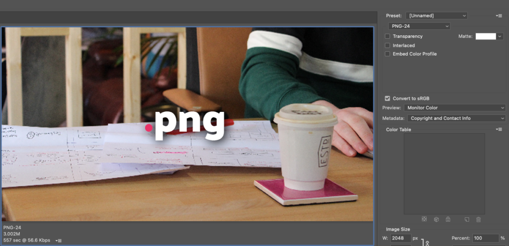
Lossless compression, as the name suggests, is a technique that compresses an image file without sacrificing any of its original data. The image is compressed in a way that allows it to be reconstructed perfectly when decompressed. The file size reduction achieved through lossless compression is generally less significant compared to lossy compression.
Screenshot of Photoshop changing the quality of a Lossless PNG image for export
Formats like PNG and GIFs typically use lossless compression. They retain the full image quality, including all the details and colours of the original image. This makes lossless compression suitable for scenarios where preserving image fidelity is essential, such as graphics with sharp edges, text, or images that require transparency.
The trade-off with lossless compression is that the resulting file sizes are usually larger than those achieved with lossy compression. Lossless compression is favoured when image quality preservation takes precedence over file size optimisation, such as in professional photography, graphic design and archival purposes.
What is RGB colour space?
Websites need RGB (Red, Green, Blue) colour modes for images because RGB is the primary colour model used in digital displays. RGB colour mode is based on the additive colour theory, where different combinations of red, green and blue light are mixed together to create a wide range of colours.
When an image is displayed on a website, it is rendered on computer screens, mobile devices, or other digital displays that use RGB colour space. By using RGB colour mode for images, websites ensure that the colours appear accurately and as intended when viewed on these devices.
RGB colour mode allows for the precise control of colour values for each pixel in an image, resulting in vibrant and true-to-life colours. It offers a wider colour gamut compared to other colour models, making it suitable for displaying rich and visually appealing images on websites.
In contrast, other colour models like CMYK (Cyan, Magenta, Yellow and Black) are primarily used for print purposes. CMYK colour mode is based on the subtractive colour theory and is designed to reproduce colours using ink on paper. Converting images from RGB to CMYK can result in a loss of colour accuracy and vibrancy when viewed on digital displays.
Therefore, to ensure optimal colour representation on websites, images are typically saved and displayed in the RGB colour mode.
Why choosing the right image format is important for your WordPress website
Choosing the right image format is crucial for your WordPress website for several reasons. First, it directly impacts the loading speed of your site, as different formats have varying file sizes and compression techniques. Second, it affects the visual quality of your images, ensuring they appear sharp and vibrant on different devices. Third, it influences the accessibility of your website, as some image formats may not be supported by certain browsers or devices. Finally, optimizing image formats helps in search engine optimization (SEO) by improving the overall performance and user experience of your website, ultimately attracting more visitors and boosting engagement.
Wibble are here to help
Having a website that has been fully optimised with imagery will tick a lot of boxes when it comes to getting up on the search results but many things can help. From responsive design working across a plethora of devices, following the Web Content Accessibility Guidelines (WCAG) and using the best practices of web development, Wibble are expert in all these things and more! If you want to see how we can help optimise your site to its full potential or to talk about our web design or web development services, please do get in touch.