Germinal UK and Ireland: A Web design and development case study
A case study into how Wibble designed and developed a brand new suite of websites for Germinal. In collaboration with Journey For.


** Part two of this series: We Are Wibble. Refresh: Part 2 – The Wibble Website. Part three available here: We Are Wibble. Refresh: Part 3 – Expanding the Brand **
Hi. I’m Dean Anthony. I joined Wibble last year as a Digital Designer. I was tasked with ‘Rebranding’ Wibble. This is how it went.
From updating branding materials here and there it became apparent that Wibble needed a refresh. Something to emphasise the growth of the company, the success, and how we’ve changed. Wibble has grown a lot in the last 12 months and that needed to be celebrated.
We needed a voice for Wibble.
We needed a fresh identity.
We needed a big announcement.
We wanted to shout – We Are Wibble!
I’m hesitant to call this a Rebrand because Wibble has always been a company that isn’t afraid to be honest with clients, to have fun with what we do because we love what we do. We just needed to amplify it a bit more.
This is a Refresh.
Divided into 3 parts, I will bring you through the process of updating The Wibble identity, Redesigning our website, and updating our printed documents.
“Part of Wibble’s evolving value proposition is a new, forward-thinking product ‘The Wibble Rescue Package’ – a fully managed service taking care of your WordPress site in every way. This is a way into the Wibble brand for a select audience and allows that audience to make sense of Wibble’s capability when it comes to WordPress.”
“Wibble is a web company who specialises in high-end WordPress design, build and support. We have experts working primarily with the core WordPress software and they are able to offer an unrivaled service that develops new websites and gets the best from existing WordPress sites.”
Something that was missing from the original brand was a set of guidelines. A more cohesive brand identity was required. Colour codes, type styles, logo marks, and buttons were all taken into account as well as Wibble unique tone of voice. Through months of research and meetings, we created an identity for Wibble that can be carried through to any medium. Whether It be print, web or beyond.
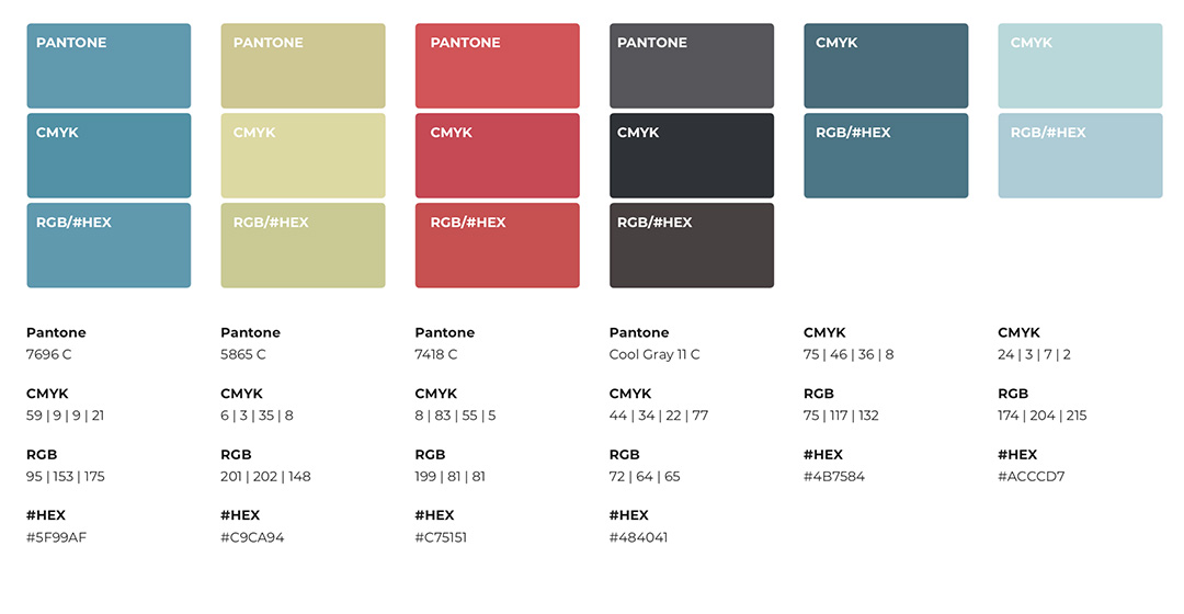
Wibble has been blue for some time, not emotionally, just the colour. There is nothing wrong with that but all blue all the time can be quite boring. Maintaining the corporate feel to the brand is great but Wibble has so much more personality than your average web development studio (We call our selves “Wibblers”) and we wanted to emphasise that. The introduction of the new ‘golden olive’ colour provided a great contrast between the blue.
The name ‘Golden Olive’ was chosen because we can’t decide if it looks greener or more gold. Either way, it’s Wibble. The red was introduced to differentiate the Wibble Rescue Package from our other services. A unique product needed a distinct colour to stand out. These new colours along with the different tones of Wibble blue gave a much need facelift to the brand, whilst strengthening the company’s message.
Colour matching was also a priority. All of our new primary colours have been carefully curated from their Pantone spot colour. CMYK, RGB, and HEX colour codes are now confirmed for consistency through all of Wibble assets.

In a world of where we want information even quicker, I wanted to create a brand mark or icon to show Wibble without ‘Wibble’. Toying with the idea of introducing a character or bringing back the jagged lines from previous iterations. Everything seemed like it wasn’t for Wibble or it was a step back. The answer to the problem was staring me in the face.

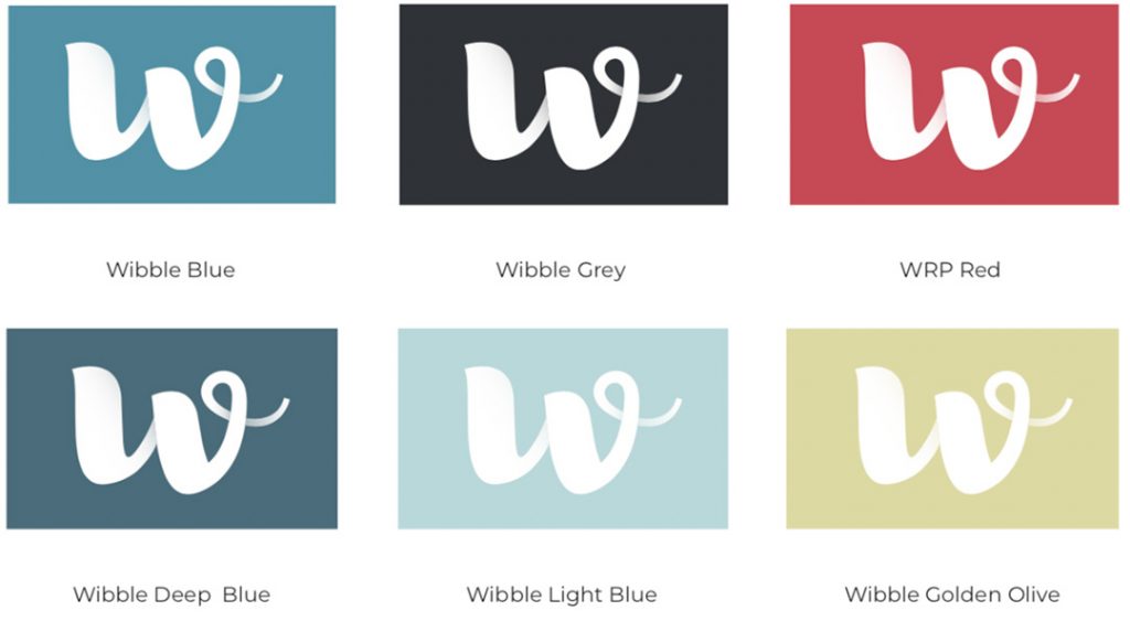
The distinctive ‘w’ in the Wibble logo stands out above anything else in the logo. By adding a dynamic gradient to the letter, It was a no brainer to use it. Created with responsive mobile design in mind where space is at a premium on smaller devices. It works with the Wibble logo or as its own logo mark. Success! It also works on a variety of background colours and is easily identified.
The original typeface (Baloo Bhaijan) was fit for purpose. Is was a fun typeface that communicated the message of Wibble and was balanced with the logo. Unfortunately, it didn’t work in all mediums and we needed a new updated typeface that would work in print and web.
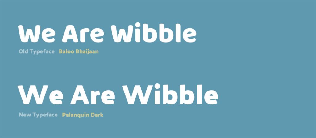
Palanquin Dark maintains the message but modernises it. It’s a Google web font but it also works very well in printed materials. Each header size and button has been curated to reflect the brand direction. Each heading legibility has improved with this punchy font. It is distinctive, strong and unique enough to recognise as Wibble. It’s perfect for the new direction of Wibble.
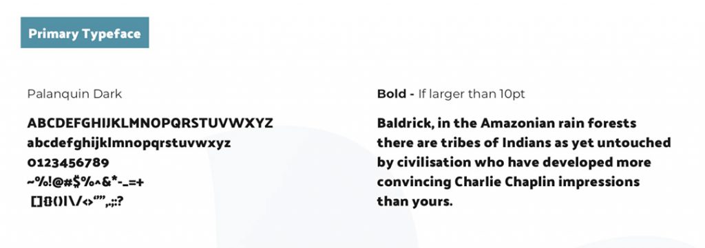
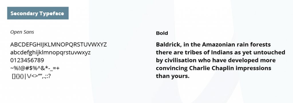
I also changed the body type. Switching from Raleway to Open Sans. This was mostly a styling decision but personally, I’m not a fan of Raleway and though I went unchallenged with my decision I believe I won.
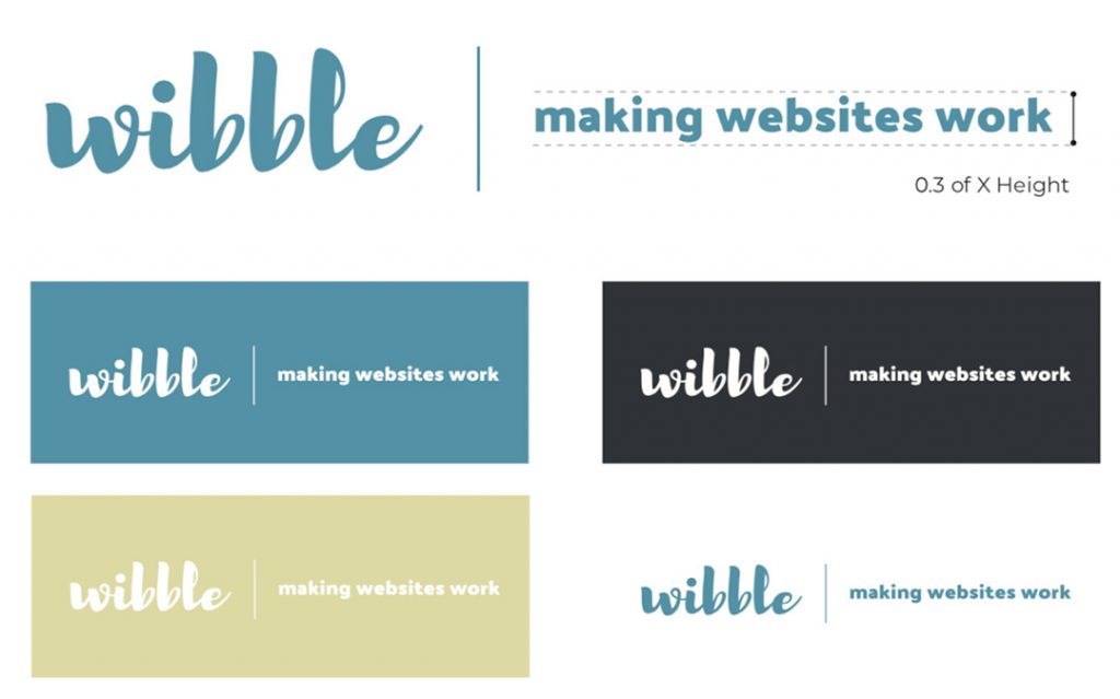
While the logo is pretty much unchanged, how it is used has. I wanted a more dynamic logo for various uses. Simply by creating a rule for the tagline and additional text. Our tagline “making websites work” was too strong to abandon and by creating this rule it was able to be used once more.
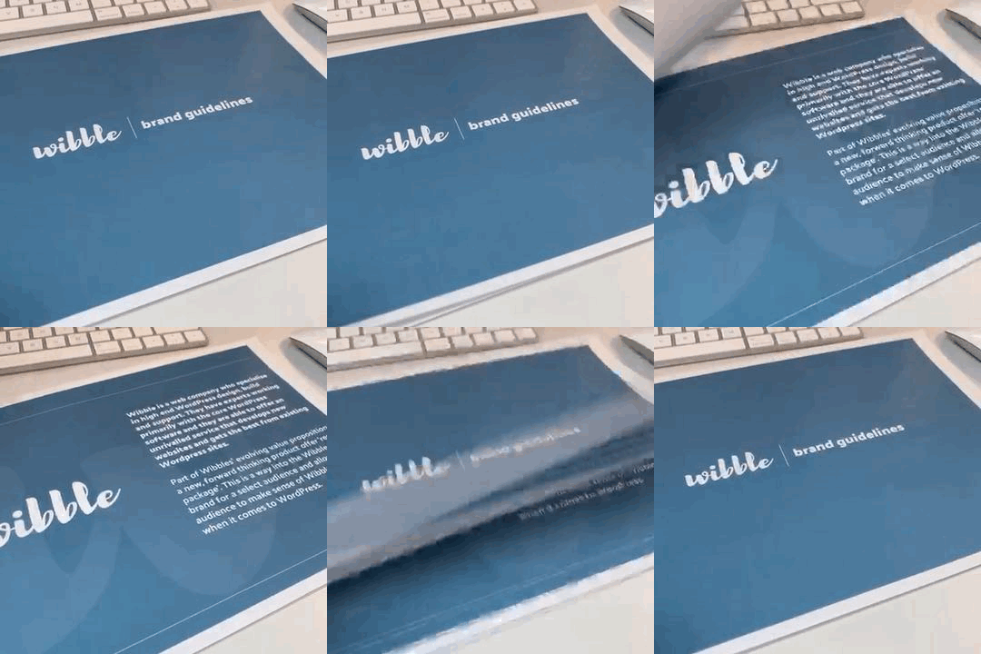
With all the changes to the brand, creating a set of guidelines was necessary for brand consistency. This guide, although only for the Wibblers, will prove most useful when it comes to getting things ready for social media and any other documents that need to be created. It’s a perfect point of reference for the brand. We’ve made our style guide available for you to see.
The updates to the brand give a fresh take on Wibble. It will certainly help with consistency when it comes to creating materials and will make communicating with clients much easier.
With the brand refreshed and updated the next stage was to update the website. The main point of contact with all our clients and future clients. You may have already noticed the redesign of the website, but in Part 2 I will be delving into the stages of the website redesign. From initial sketches to concept creation, to using interactive prototypes before the final build by the web development team. Thanks for reading.
Studio Location
Floor 2,Telephone
+44 (0)28 90 098 678
Get in touch with us today with the details below, or use the contact form to ask us a question and one of our Wibblers will get back to you.
"*" indicates required fields