At Wibble, we believe the Internet should be accessible to everyone. That’s why we ensure our websites are designed for all users. This isn’t just about helping people navigate your site. It also significantly boosts your website’s performance in Google rankings, site speed and usability. When you choose Wibble, you choose a website crafted with careful attention to detail to deliver optimal results. Everything is done with purpose, whether it’s the user experience, colour choices, heading sizes or other design elements. In this blog, we’ll walk you through the processes we’ve developed over the years and how we continue to expand our expertise to become the leading web design and development studio in Ireland.
web content accessibility Guidelines (WCAG)
Let us start at the beginning. When starting a website concept, we ensure we are designing for web accessibility. The most widely recognized standards are the Web Content Accessibility Guidelines (WCAG). The WCAG uses four key principles that help guide us.
Perceivable Content
This is content that is presented in a way that users can, well, perceive. It usually comprises providing text alternatives (ALT text) for images, having captions on videos (YouTube), and making it easier for the user to read and see content (contrast). When an image is selected, adding ALT text to images in WordPress can be done via the media library or the sidebar settings. There is more info about ALT text, further down this blog.
Operable Content
Operable content is how the user interacts and navigates the site. Making the site navigatable by keyboards, allowing users time to read content and allowing users to find what they are looking for easily.
Understandable Content
Content should be easy to understand with simple clear language. Navigation should be simple and consistent. The user should be able to understand what you are offering and should not be getting lost, basically.
Robust Content
Futureproofing the website to the best of our ability to work with future technologies and provide compatibility across multiple device sizes and platforms.
In summary, we will follow these guidelines to give you the website of your dreams but we also follow the rules of the modern and future internet. Gone are the days of the flash website that took about a year to load on dial-up. Users want all the information in an easy-to-digest form and for it to not be a struggle for anyone to view it. These are all things we take into account when designing your website here at Wibble.
colour contrast and AAA ratings
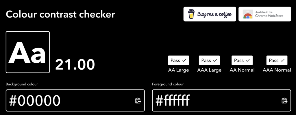
Once we have got your brandguide this is where the real designing of your website begins. Colour contrast can be the single biggest issue for accessibility. Colour contrast is the difference in brightness between text or other elements and the background it sits on. Scored out of 21.00 with black and white being a perfect score and rated between AA and AAA. We aim to hit AAA but sometimes the colours do not allow this and we would use AA generally for larger text.
Differences in the contrast ratings
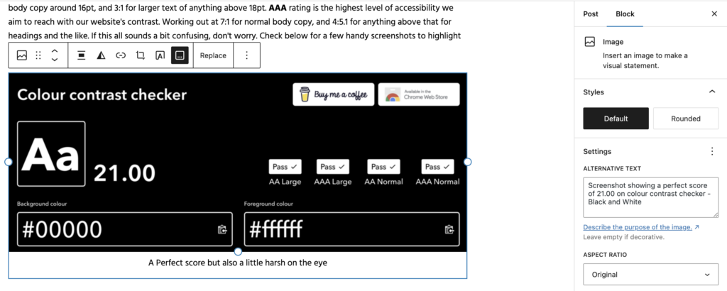
AA rating is considered the minimum standard for most websites aiming to be accessible with a score of 4.5:1 for normal body copy around 16pt, and 3:1 for larger text of anything above 18pt. AAA rating is the highest level of accessibility we aim to reach with our website’s contrast. Working out at 7:1 for normal body copy, and 4:5.1 for anything above that for headings and the like. If this all sounds a bit confusing, don’t worry. Check below for a few handy screenshots to highlight what I mean by using one of our favourite tools here at Wibble.
A Perfect score but also a little harsh on the eye
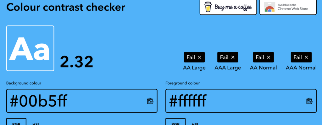
Not perfect but the blue on white passes AA but fails on AAA normal
An abysmal score that will affect your website performance. Please don’t provide us with these colours. Thanks
colourcontrast.cc is our go-to tool for contrast checking at Wibble. It gauges and guides us on how we can use colour throughout your website. We aim to use as much as the brand colours provided to us, but our decisions are generally based on these ratings. It is also a good idea to check your colours with the above tool. This will give you a better idea of why some can’t be used. At Wibble, we will always try to create the vision you want for your website, but like most things in life, there are a few rules that even we as humble designers must adhere to.
Headings and why using H1 multiple times is bad for SEO
If you’re one of our fortunate clients who already has a WordPress website built by us, first of all, thank you! You may already be familiar with headings and their different levels. From H1 to H6 they are a means to breaking up content through webpages, but there is a reason why there is only one H1 per page.
it’s all (type) semantics
It all comes down to Type Semantics or elements in HTML that convey the meaning or purpose of content rather than its appearance or styling if you will. These elements or <tags> help structure webpage content in a way that boosts accessibility, search engine optimisation (SEO) and overall visual clarity for the user. It helps with screen readers as well allowing users with limited sight to interpret the content correctly. It’s all quite good indeed.
Hierarchy of headings example
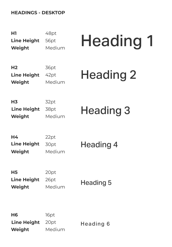
Use this page as an example. The title “The Importance of web accessibility in Web Design at Wibble” is a Heading 1 <h1>. You only use this once on any webpage and is the largest and most important for SEO and accessibility. Heading 2 <h2> is the next size down usually used to create main sections under the main <h1> such as the title of this section. These can be used multiple times throughout a page but are generally used for titles of larger sections of a single page. With me so far?
Heading 3 <h3> again, smaller than <h1> and smaller than <h2> is generally used for subsections within another section. eg. the breakdown of the WCAG’s four key principles above. Heading 4<h4> through Heading 6<h6> progressively get smaller and are used for further subsections and more detailed sections such as category markers on blogs, or listing what we did on the website. You can see these examples in the many portfolio pieces we have on our work section of the website. Nice plug there.
What these sizes do, in brief, is create a hierarchy for the content, making a lot of information easier for the user to digest. Using these headings in the order and in the correct manner eg. using the <h1> only once, allows for Google to read the site and index it accurately on their search engine getting your site ranked. Above is an example of how we do this within our style guide. We don’t want you to think we are putting things on a page for the sake, there is a reason behind it all.
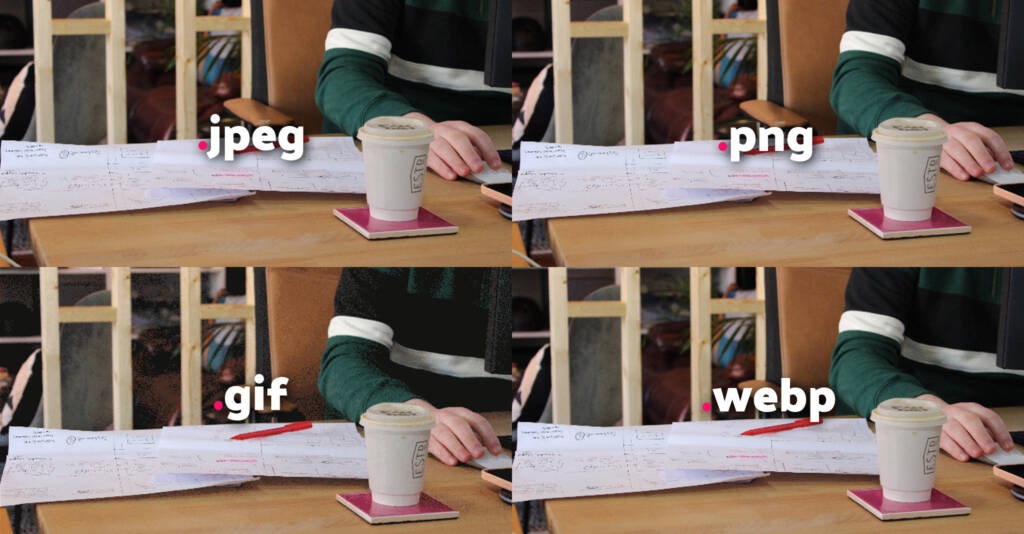
because reading your images is what? fundamental
ALT tags or ALT text are descriptions added to images in the WordPress CMS, they are different from captions and are used to describe what the image is showing visually. They have many important reasons why they are used but again, like the blog title suggests, it comes down to accessibility and SEO.
ALT text was originally used if images could not be loaded. If an image failed to load due to a technical issue, broken link or slow connection the text would appear instead within the frame the image would have taken up. While this can still happen it is mainly used for other reasons now.
Inception or what? Adding ALT text to images of this very blog
ALT text helps users with visual impairments understand what the image is. It is like the audio description on television shows. Screen readers can pick these alt text descriptions up and read them out to the user describing the image allowing them to understand what is being represented. Because of this, it is important to spend time on your ALT tags so they can accurately describe images and make your site accessible to all.
ALT Text is also very beneficial for SEO. Google isn’t human and can’t see images like we can. It scrubs your site looking for information but this information is text-based. Having good descriptive ALT text can increase your Google ranking in not only site searches but also image searches.
Why all this matters
In summary: to get the best out of your site.
But, in another way: to make the web accessible for all. At Wibble, we are committed to making the Internet accessible to everyone. Our focus on designing websites that cater to all users goes beyond simple navigation; it also enhances key issues that matter on your site like Google rankings, site speed and overall usability. Choosing Wibble means opting for a website that is designed with you and the end user in mind with exceptional attention to detail. From the overall user experience and colour choices to heading sizes and other design elements, every aspect is thoughtfully considered to make the internet a more accessible playground for all.
If you want to get started on your website journey with Wibble please do get in touch.