Like most great students of Milford Academy, grids “should neither be seen nor heard”, but they are always present in Web design. I’ll just wait here until someone gets that reference.
Grids systems within web design provide a very important use for both the designer and the developer. Grids work as a guide as to where elements should be placed instead of randomly firing information at an artboard without any real cohesion. Setting up a grid at the beginning of a design can prevent the designer from running into a myriad of problems when it comes to layout further down the line.
It has taken me a few years to truly appreciate the need for a grid system in my work. I would carefully align elements to match and space them equally, or so I thought. Grids should always be used!
Guidelines used to be the norm for web layouts in Photoshop, but with more specialised programmes for web design, such as Adobe XD and Figma, grids are much easier to set up and provide your final concept with the cohesion and ideal user experience that we all so crave.
What is a Grid System
Grid Systems date back as far as books. They were initially created as means to separate blocks of text and illustrations on a page. Whether this is from handwritten duplication or the first printed books by Gutenberg himself, it was a way of displaying the content in a cohesive manner without simply throwing information at a page. The principle has evolved but it can still be traced back to those trusty monks in their towers, endlessly copying manuscripts and praying the Vikings don’t come and ruin their fun.
Grid Systems follow a few rules, but the main one is displaying the information in a readable format for all consumers. They are there to provide a hierarchy of information and to display elements correctly. There are many types of grid systems used throughout the design world, but for web design, column and hierarchal grids are the norms. Grids display a number of columns within a container of a website, separated by a gutter.
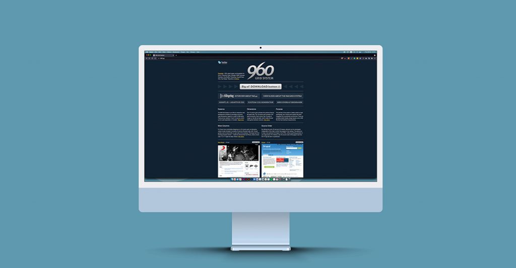
There is a ‘golden rule’ that “The 960 Grid” is the one and only solution for the web. This breaks down as a 960px container, with 12 columns at 60px each and a gutter (the space between columns) at 20px. Using the 12 columns allows for more flexibility when placing elements eg. 4x4x4x4 or 3x3x3 etc.
The 960 Grid System Project
The 960 Grid System was used, and still is to this day, for when the web was a different place. With the advent of larger screens and multiple devices that we access the web with it doesn’t always work out. In a world of responsive design maybe something that was once a rock to many designers in the past is just gravel now.
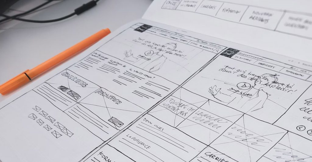
At Wibble, our concepts start out on paper. Using a dotted notepad to sketch out the wireframes of a website gives an idea of where each element will sit on a page. It is best to start this way, even if the sketches are incoherent to the naked eye, as it gives an impression of how the elements will sit within the column grid.
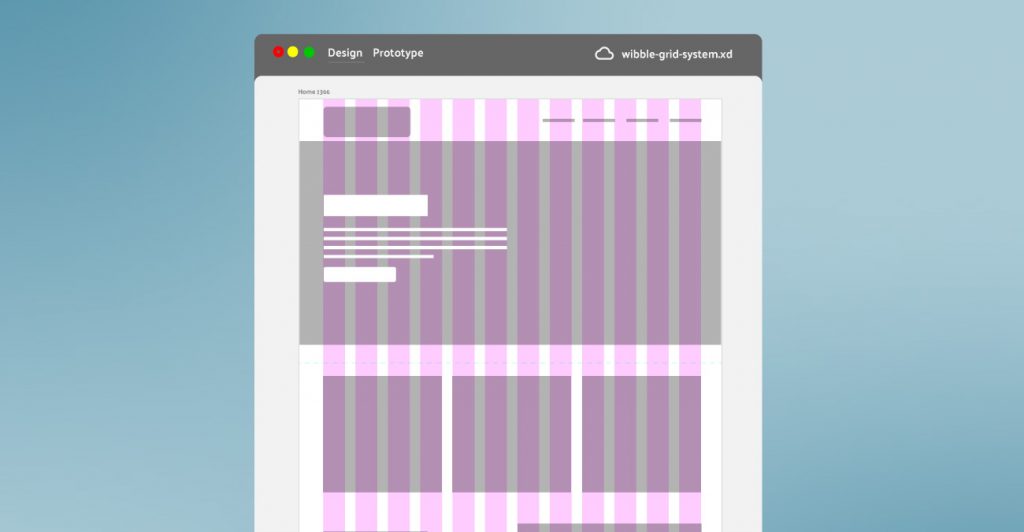
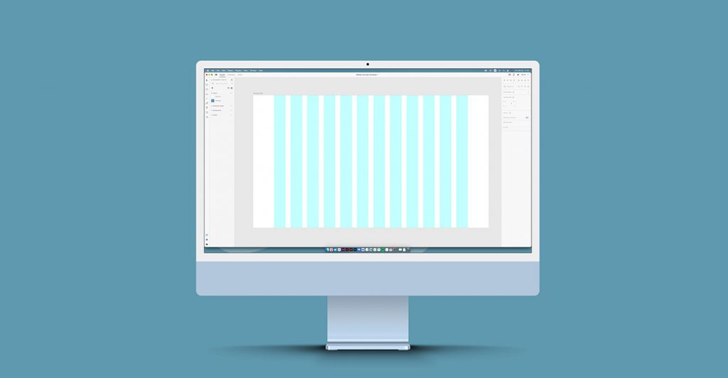
A Grid displayed on a blank Adobe XD artboard
We design using the 12 column grid. Just like the 960 rule, but expand the boundaries of the container. We have even columns, just like the 960 rule, and use an even gutter. We alter this for the actual screen size we design for. The most popular screen size as of writing is 1366×768 on desktop and 375×667 on mobile. While these screen sizes change quicker than apple removing every conceivable port on an iPhone, we have found that these are the best suited for our design and dev team. The container we aim for is 1200px, this allows the 12 columns and a gutter of 30px with plenty of space outside the boundaries of the container. Whilst the container size can change depending on the site we always aim for a 12 column grid that allows for maximum responsiveness for mobile devices, and even larger screens.
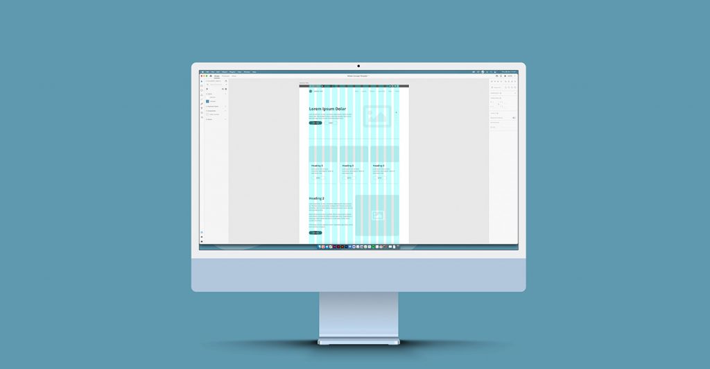
Grid systems displayed on Adobe XD with Elements placed.
With our grid set we layout out our elements. These are images, text, video, blocks, or any other content that may appear on a website. Elements must always fall within the columns, they should not fall in-between the gutter. This again allows for screen size changes from mobile to larger screens. If elements were to fall outside the column they would not flow correctly and the user experience would take a hit.
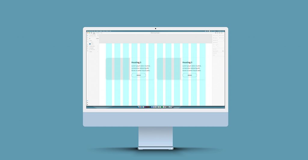
Grid systems displayed on Adobe XD with gutter overspill
However, there is a caveat to this rule. If an element features both picture and some text, and flows over four columns, as long as the parent element is contained the child element can wander in the middle of the gutter. This technically means it is within the grid as it is seen as one singular element as opposed to 2 separate elements. Makes total sense right?
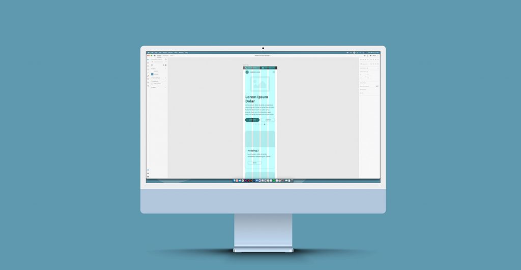
Grid systems displayed on Adobe XD with on mobile
Mobile is different. Naturally fitting 12 columns onto such a smaller screen would provide little to no benefit. In this case, we simplify the grid using the same principles but use 4 columns, keeping the dividend of 12 but on a much smaller scale. This process has worked for us and as screen size changes and phones get bigger we will inevitably need to look back on container sizes, but the principle will still remain the same. 12 columns with an even gutter, and a standard size of container that can be scaled evenly.
While all this might seem a bit confusing its purpose is to present the information on a website as cohesive as possible. By sticking with this process and using the grid as we do it streamlines the design and development process at Wibble. It minimises the need to design concepts at multiple screens size, that alone would eat into a healthy chunk of design time. This is a process that has worked for us and hasn’t, as of yet, caused an argument between our design and development teams.
We aim to deliver you the best at Wibble and by giving you an insight into the thinking behind our concept designs, and why we believe it would work for your website. Grid systems may be strict but the design of your website will certainly reflect you and your business. Check out some of our work using the principles above here.