At Wibble, we are always pushing the boundaries of stunning web designs and creative web development. We believe that every web design project should be as unique and interesting as our client’s brand.
In this post, I will be covering the use of SVG clip paths to create stunning visuals on the award winning websites we build and some examples of how I implement these.
What is an SVG? Let’s find out
Before we dive into the exciting world of SVG clip paths, let’s briefly understand what an SVG is. SVG is an image format for vector graphics and it stands for Scalable Vector Graphics. Unlike raster images (such as JPEG or PNG), which are composed of pixels and can lose quality when they’re scaled, SVG graphics are made up of mathematical shapes and so they retain their sharpness and clarity regardless of the size they’re displayed in, meaning that they are perfect for use in websites which are of course viewed on many different screen sizes. SVG graphics can be resized and scaled without sacrificing image quality, making them perfect for responsive web designs that adapt to various screen sizes, from small mobile devices to large desktop displays. Our lead digital designer, Dean Anthony, covers these various different image formats and exactly when they’re best used in his blog post.
If you open any SVG image file in an IDE, you will notice that the file is in an XML format.
The <path /> is what we will use as the shape that we are going to apply to an element.
What is clipping? I’ll explain
Clipping is a technique that is used to control the visibility of an element on a webpage. This involves defining a boundary or a path, which is known as a clip-path, which then determines that the portion of the element that falls within this boundary is shown. Then the portion of the element that is outside this boundary is ‘clipped’ and hidden from view.
Clipping is a powerful concept in web design because it allows us to develop visually appealing designs which enhance user experiences. With traditional CSS clipping, regular shapes like rectangles, circles, triangles or rounded rectangles are commonly used to hide unwanted parts of an element or creating small interesting features. However, SVG clip paths take this concept to a different level by offering the flexibility to use any SVG shape or path to define the clipping area.
Lets talk about SVG paths
As SVG clip paths make use of an SVG’s shape, we aren’t limited to basic shapes; we can create intricate and complex clip paths using a combination of multiple different shapes or even a new custom shape altogether! These SVG clip paths allow for creative and engaging designs to be implemented on the web.
Now that we’ve established what they are, let’s cover some examples of how we can use SVG clip paths to create these interesting designs.
Using SVG clip paths
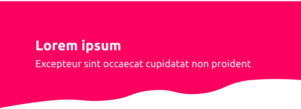
In this use case, we need this element to conform to a specific shape as well as being the full width of the screen and remain responsive as the screen size changes (like going from desktop to mobile, for example).
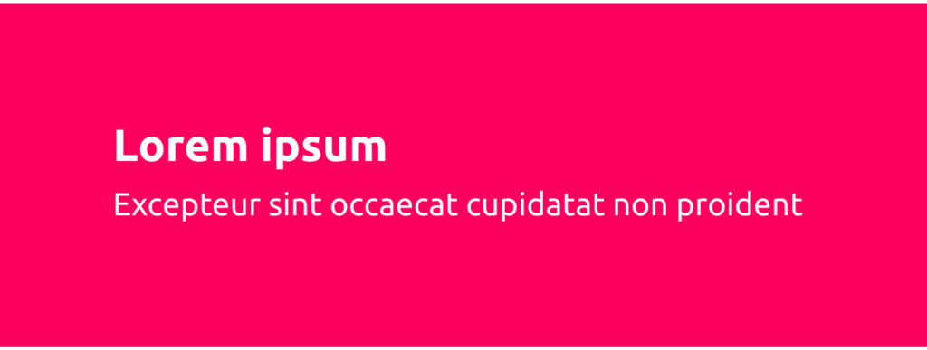
We will be using this element which is a typical hero for a webpage. It’s fine as it is, however, we want it to have a specific shape at the bottom of the hero.
The hero element
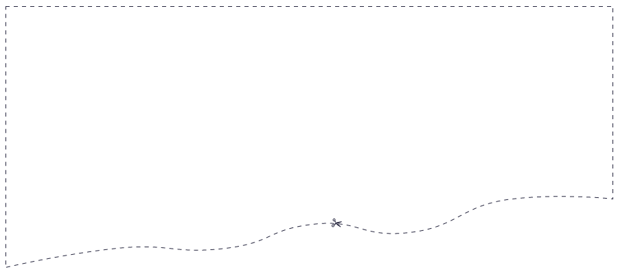
The shape we want
We will add the SVG to the webpage and assign an id to the <clipPath /> which we will refer to later.
SVG clip paths allow for a wide range of creative possibilities in web development! At Wibble, we combine our expertise in web design and web development to create websites that are visually stunning and interesting to interact with. If you’re ready to elevate your online presence with creative and engaging web designs, let Wibble transform your web projects into exciting digital experiences. Get in touch with us today and embark on a journey of creativity and success.