Getting visitors to your website is great, but how do you keep them there and get them to turn into customers? When we are designing a website, this is something that we keep in mind at all times for you and how to make the website user-friendly. From great visuals to easy navigation, every aspect of your website plays an important part in turning your visitor into a customer. Here are some tips, that we utilise in web design, that will help you understand how to do this.
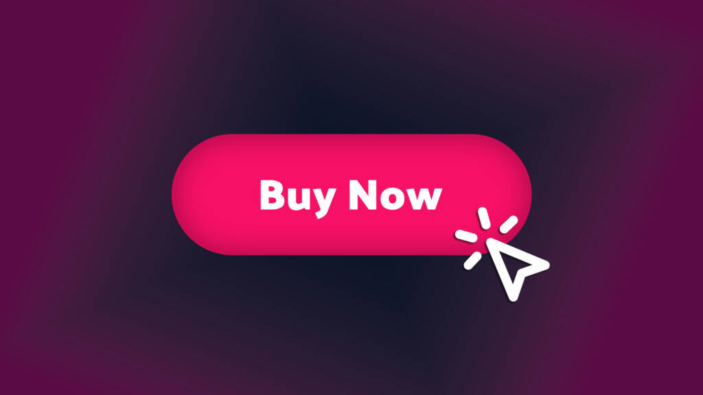
Clear and Compelling Call-to-Action (CTA)
A strong call-to-action (CTA) is the cornerstone of conversion-oriented design. Whether it’s “Buy Now,” “Sign Up,” or “Contact Us”, your CTAs should be prominent, visually appealing and communicate the desired action. Use contrasting colours, compelling copy and strategic placement to draw attention to your CTAs and encourage visitors to take the next step.
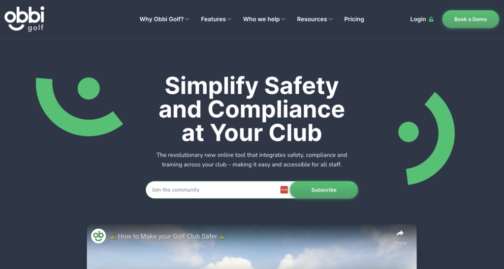
Streamlined Navigation
“The more the merrier” they say but not always the case with a navigation bar. If it’s too complicated and overwhelming, customers will leave the site and there will be fewer conversions. As a rule, when designing a site we try to stick to seven or fewer items on a menu nav bar. If your menu needs more than seven then I would look at how we could group some similar themes into a sub-menu for example “Meet The Team” could sit under “About Us”. Make it easy for visitors to find what they’re looking for with clear pathways and intuitive navigation menus. A good example of this is Obbi Golf
Optimised Landing Pages
Landing pages are important in driving conversions by focusing visitors’ attention on a specific offer or product and designing your landing pages with conversion in mind, using persuasive headlines, engaging visuals and concise copy that highlights the benefits of your offer. Remove distractions and minimise exit points to keep visitors focused on the conversion goal.
Trust
Customers need to trust you and your site so that they become customers. You can do this in several ways, examples include customer testimonials, reviews, security badges and industry certifications. This in turn will bring credibility and reliability to your brand.
Visual Hierarchy
Effective use of visual hierarchy directs visitors’ attention towards the most important elements on your website, such as CTAs, product images and key information. Use size, colour, contrast and placement to prioritise elements based on their importance and guide visitors through the conversion process. Ensure that critical elements are prominent and easily accessible, while secondary elements are de-emphasised to prevent distraction.
Examples of this would be in the header and logo. A large, visually striking hero image or banner is often used to capture visitors’ attention and communicate the website’s main message or value proposition. This element is usually placed prominently at the top of the homepage, commanding attention and setting the tone for the rest of the page.
Headings and subheadings are used to break up content and provide structure, with larger font sizes and bolder styles indicating hierarchy. Clear and descriptive headings help users quickly scan the page and find the information they’re looking for.
Product Images and Thumbnails
Product images on e-commerce websites play a central role in showcasing merchandise and enticing visitors to purchase. High-quality images with zoom capabilities and multiple angles help users visualise the product, with larger images typically given more prominence.
Mobile Optimisation
With an increasing number of users accessing the web on mobile devices, optimising your website for mobile is essential for driving conversions. Ensure your website is responsive and mobile-friendly, with fast load times and intuitive navigation that provides a seamless user experience across all devices. Streamline forms and checkout processes for mobile users to minimise friction and encourage small-screen conversions.
Footer
The website’s footer typically contains secondary navigation links, contact information and legal disclaimers. While less prominent than the header or hero section, the footer is still important for providing additional context and navigation options for users.
Conclusion
All of these above are what the designers keep in mind during the design process here at Wibble. Designing for conversions is about more than aesthetics (as much as we love them)—it’s about creating a user experience that gets visitors to take action. By applying these tips and best practices, you can optimise your website to effectively guide visitors through the sales funnel and turn them into satisfied customers. From clear CTAs to streamlined navigation and trust-building elements, every design decision should be made to drive conversions and ultimately grow your business online.
Get started on your web design project today
We can guide you every step of the way. Whether it’s Design, Development, Hosting or Support – Wibble are here to help. Get in touch with Wibble today.