Wibble have a very proactive approach to WordPress development. We are constantly reviewing and improving our web development processes and are always trying to actively research and implement improvements. This is one of the ways we ensure that our set up is most effective for us and our clients.
Below, one of our web developers Karl details a relatively new introduction to our web development set up.
CSS in Theme Development
In past theme builds for clients, we used the Bootstrap CSS framework at Wibble. Specifically, we use the Bootstrap Grid part of the framework, as the bespoke themes we build require completely custom components. Therefore, we only needed the responsive and structural classes from that framework to get a starting point. The rest would be custom classes to match each custom layout that a website required.
This would result in some inconsistencies. Developers can have different approaches to class naming, and different approaches to building a component. This can prove difficult when you’re working in a team, and you need to jump into a project that’s been started already. It also makes it hard to manage a stylesheet. You have multiple developers creating classes for different areas of the site, and you’re bound to have some overlap in what each class is doing, and there could be some naming inconsistencies.
Utility-First
Tailwind is a relatively new CSS framework that’s gained some major traction with developers. It provides a different approach to building sites, where you use utility classes to achieve desired layouts. While this concept isn’t new, as Bootstrap has aspects of this, Tailwind takes this a step further.
Tailwind’s entire approach is to use utility classes. You don’t need to come up with class names, jump back and forth between your HTML and CSS file. All you need to do is just apply the classes you need. Tailwind doesn’t make assumptions on what your content should look like, so there’s no included classes for things like buttons, cards, or alerts. Instead, you just build these using utility classes.
This is where Tailwind is a winner. Tailwind’s approach results in little to no custom classes. It provides classes that each achieve a different css property. Instead of a class trying to do a bunch of things, Tailwind classes focus on a specific property. Like .flex for display:flex; or .pb-4 for padding-bottom:1rem;. Or if you needed to target a certain screen size, you could add .md:hidden for display:none; if you wanted to hide an element on medium size screens. The ‘md’ part of the class targets that screen size and larger, with a mobile-first approach.
Mobile-First
Out of the box, it comes with many features. Things like responsive classes, that allow you to apply a class to a certain screen size. These are also mobile-first, meaning you apply your classes for mobile, and then work your way up to larger screens. You also have the option to target different element states, such as hover or focus. Need to change the background colour on hover? There’s a class for that.
<div class="justify-start sm:justify-center md:justify-end lg:justify-between xl:justify-around ...">
  <!-- ... -->
</div>
Customisable
To customise things, you have a file called tailwind.config.js, where you can define and modify what classes get generated. Here, you would define your colour scheme, which automatically generates classes to target ‘background-color’, ‘border-color’, and ‘color’. You can also configure things like your spacing scale, which in turn gives you classes to target ‘height’, ‘width’, ‘padding’ and ‘margin’.
// tailwind.config.js
module.exports = {
  theme: {
    screens: {
      tablet: '768px',
      desktop: '1024px',
    },
    colors: {
      primary: {
        100: '#ebf8ff',
        300: '#90cdf4',
        500: '#4299e1',
        700: '#2b6cb0',
        900: '#2a4365',
      },
      secondary: {
        100: '#fffff0',
        300: '#faf089',
        500: '#ecc94b',
        700: '#b7791f',
        900: '#744210',
      },
    },
    extend: {
      boxShadow: {
        huge: '0 30px 60px -15px rgba(0, 0, 0, .25)'
      }
    }
  }
}
Consistency in Teams
When you apply these features to a new website build, it allows you get started quickly. You input the colour and sizing requirements to the config file, and you’re good to go. You get a consistent approach to building sites, that better allows for other developers to jump in and assist. There’s less ambiguity of what a class is doing. You don’t need to jump back and forth between style sheets and html, trying to figure out how another developer built a component , it’s all there in one file.
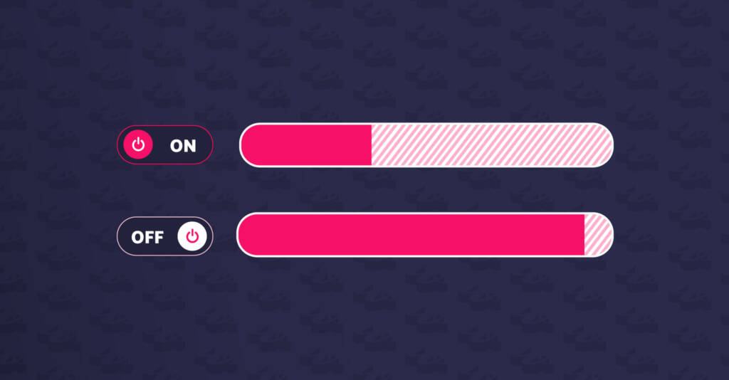
Filesize
With all of the those utility classes arises a problem. The file size of your generated stylesheet by default with Tailwind can be over 700kb. Compared to 180kb for Bootstrap. What if you don’t use all of the generated classes? That’s where PurgeCSS comes in. It’s a tool that allows you to “purge” a css file of classes that aren’t in use. This tool isn’t unique to Tailwind, but it’s essential for the Tailwind approach to be successful.
What this means for theme development
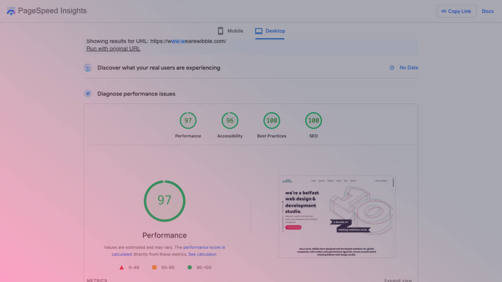
Using Tailwind, in combination with PurgeCSS, we have smaller CSS files bundled with themes. This translates to faster load times for the end users.
Along with faster websites, we also get faster development times. When it comes to developing a new site, using this really streamlines the process and allows for more developers to join in more easily. As Wibble grows, and we add more developers to the team, this will be really important.
This is all part of the process of delivering the best possible product we can to our clients. We’re always looking into the newest technologies to see what we can use to deliver better results.