We have all been there, trying to use a website on a mobile phone or smart device and you have to zoom, scroll and tap to see the critical content that you need. More and more people are now accessing websites on a variety of devices and there has been a significant move away from solely using a desktop to browse the internet.
An intelligent approach to web design is that when the user views a website on their smart phone, tablet or desktop, they are presented with a website that adapts and changes to suit the screen size of the device. This approach is called responsive web design.
Responsive Websites and Google Results
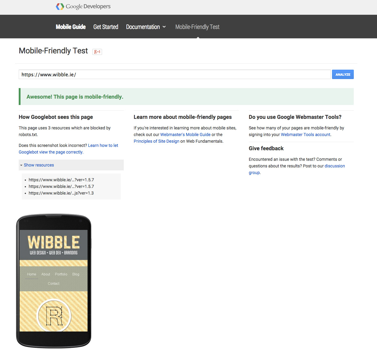
One thing that has made creating responsive websites more critical is that since February 26, 2015, Google officially announced that mobile friendly websites will get a boost in Google’s mobile search results and on April 21, 2015 they released the update to their algorithm. They had already started the process of emphasising the importance of a responsive website by highlighting sites with the tag ‘Mobile-friendly’ in mobile search results. The image below is a screenshot of the search engine results for Wibble on a mobile device.

This update is clearly a call to action for websites to be fit for purpose, irrespective of what the device being used is. One good thing for people who do not have a mobile-friendly site is that Google have announced that your site will not just disappear off the mobile results. If your site has proven quality content for the search term then you will still appear, however, this may be a temporary step.
Testing your Website to Check for Mobile Friendliness
Luckily, Google has a number of resources to help you out with ensuring your site is mobile friendly / responsive. The mobile friendly test tool is a great resource to test any website out there for mobile readiness. We ran Wibble.ie through and the results are below or you can view the results on the Google Developers page.
 Google Criteria for Mobile Friendliness
Google have announced a number of criteria in order for your site to be deemed mobile-friendly. Google have stated that the criteria means that your site is either mobile-friendly or not and this will be reflected in the rankings. This is another reason to take the results of the mobile friendly test tool seriously. Some of the criteria released by Google are below:
- Small font sizes
Having a site that the text is impossible to read on a mobile device, means that the user is having a bad experience.
- Tap targets/links are too close together
This is again about user experience and will deter users from your site. Ensuring that links are easily clickable and not too close to others will ensure a better overall experience.
- Readable content
The content has to be visible and readable without tapping or zooming. This is pretty easy to test for.
- The viewport
The inclusion of a viewport meta tag is required. A viewport meta tag gives the browser instructions on how to control the page’s dimensions and scaling.
Taking all the above into account, if you have all of those and your site is mobile friendly then your website will benefit from the ranking change.
Problems with Responsive Sites
Having your site scale to the size of your device is a huge step and has improved mobile usability by a massive degree. However, if your site contains an image that is 2000px in width and 400kb in size and you view it on a mobile device, this image is still downloaded in full but just scaled to the size of the screen. Also, if your site contains JavaScript or a massive slider that is not required on the mobile site, this will also be downloaded even if it isn’t shown in the mobile device.
This is a big issue if you are viewing the site over 3G or less. All these files are downloaded irrespective of whether they are used or not. Site speed is an issue here along with data costs.
Wibble and Mobile Friendly Sites
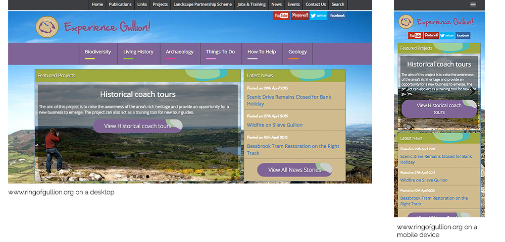
Every site that Wibble develops is mobile friendly, that is that the site reacts to the size of the screen that it is currently on and displays the website and content in a clear and legible way. Below is an example of one of our more recent projects – www.ringofgullion.org. In the image below, you can see the full size screen on the left compared to the smart phone on the right. We used a number of techniques for cross browser and cross device compatibility and some are detailed below:
- Responsive Framework
The structure of the site is built using Bootstrap. This framework is used to help with responsive web development.
- Mobile Detection
The site detects when the user is on a mobile device and does not download unnecessary code or images. This sees a huge improvement in site speed.
- Collapsable menu
In order to save space on the screen, the two menus combine into one and are accessible through the universal ‘hamburger menu’.
 Conclusion
If your site is to be used by customers or potential clients then having a mobile friendly site is a must. The experience of using a site that is not mobile ready is enough to put off many users from continuing on your site.
More reading
A Google guide for mobile website development
Q&A session with Google for mobile-friendly ranking change
Responsive web design basics by Google
About Wibble Web Design and Development
Wibble is based in Crossmaglen and Belfast and we specialise in Web Design, Web Development, Branding and Graphic Design. Wibble has developed into a specialist creative studio and web development company with a range of clients around the globe. We have provided responsive development expertise to clients around the globe.
If you are interested in working with Wibble on a web design and web development project, or are interested in working with Wibble on a responsive web design project contact Wibble today.