Web Development

Enhance your WordPress site’s search with FacetWP
Adam gives a rundown of the FacetWP feature set and why it has helped to change the way he approaches WordPress searches.

By Adam Cherry
11 November, 2021 • 5 MIN READ

** UPDATE Part 2 of this series is available here: Being a Web Developer in 2019/20 – Part 2: Choosing the right CSS framework **
In 2019 we are so fortunate to have the vast array of programming languages and frameworks, such as React, Vue, Angular and many many more. As nerdy as it sounds, there has never been a more exciting time to be a Web Developer. At Wibble we pride ourselves on our dedicated WordPress development and with a team that accumulates years of development experience all at easy access for our clients. In this 3-part series, I will be going over the in’s and out’s of being a Web Developer in 2019/20.
If you were anything like me at the beginning of your web development journey, you may have thought what on earth is CSS and how am I meant to learn every possible option it has in its library. I took to the fundamentals of HTML fairly quickly; I even grew quite proficient in PHP but CSS was always an after thought. Honestly as the answer usually always is, it takes time and lots of practice to learn. I’m still learning new things to this day with CSS.
From a conversation with a friend I had about web development, the word Bootstrap was brought up. Bootstrap! As in the guy from the Pirates of the Caribbean movies? Turns out it’s actual a very popular CSS framework which has helped improve and mould the type of web developer I am today.
This isn’t going to be some monologue about what is Bootstrap and its fundamentals, I’m afraid I’m a decade too late to the party. Instead I’d rather talk about the question many developers ask in 2019, is Bootstrap still relevant? I’d be lying if I told you we are above Bootstrap here at Wibble as every one of our websites. Hundreds of WordPress themes use Bootstrap, why should ours be any different? Research from W3Techs shows that 19.6% of websites live today uses Bootstrap. 19.6% may sound like very few but according to Mill for Business, there are 1,518,207,412 websites live as of January this year. Now does 19.6% still seem like a small amount?
I am focusing more on the effects of Bootstrap with site speed. Does the Bootstrap way of coding cause too much bloat? Now with regards to file size, it’s just as easy, if not easier, to link Bootstrap through a CDN link rather than the physical file in your site’s directory, but with every
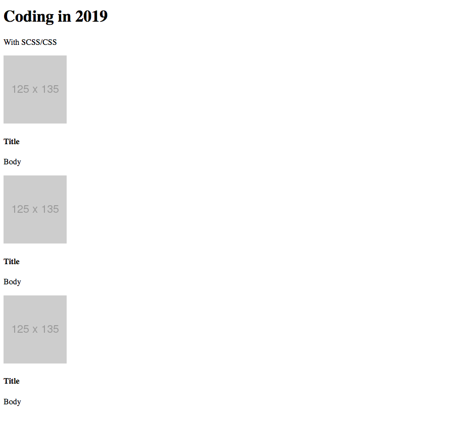
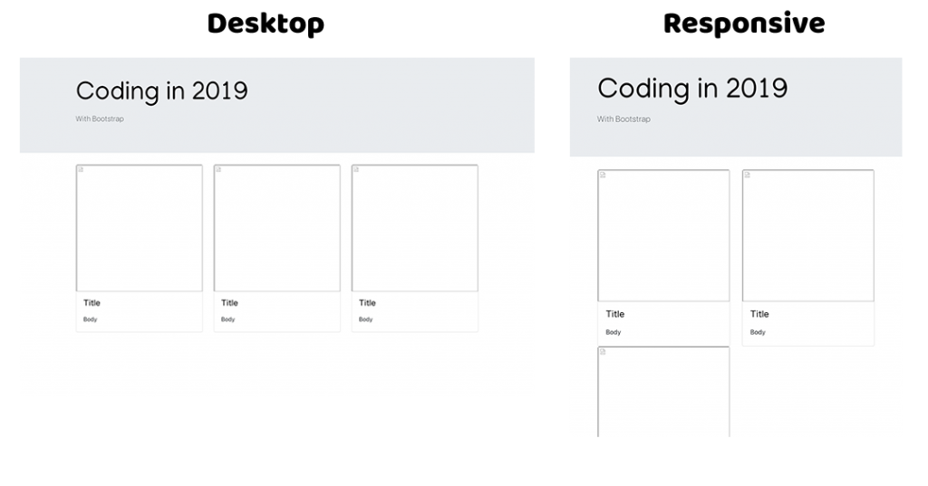
To get started, I was looking to create a simple static page with a header and a responsive 1 x 3 card set-up. For those quite versed in Bootstrap, you will know they have a pre-styled card class, so this couldn’t be any easier to do. Bootstrap uses flex and using a structured row and column HTML layout, you can set the responsiveness of the cards. Seems super easy right? That’s because it is when you pick it up with practice.
But what if there was a way to further reduce the amount of HTML code needed to set-up the flex layout. When developing massive projects, reducing the amount of code needed not only saves file size but saves the developer a considerable amount of time when coding. Luckily in CSS there’s an answer for this, Grid! Why use the row and column HTML structure that Bootstrap requires when you can do it all yourself with one line of code. With grid you can simply specify that your columns are responsive all in one line rather than messing with media queries.
.card {
  display: grid;
  grid-template-columns: repeat(auto-fill, minmax(300px, 1fr));
}
The code snippet above acts the same as Bootstrap’s col structure without having to specify breakoff points. It simply fills as much content it can into it’s rows length, before it starts a new line.
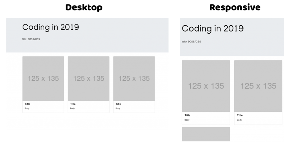
Using grid I have replicated the same page layout I created using Boostrap with half the code. This in turn drastically reduces the file size and the overall project size.
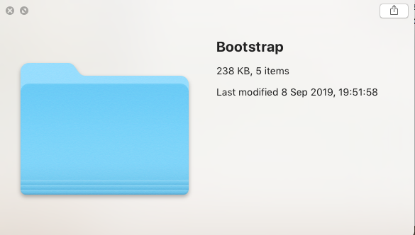
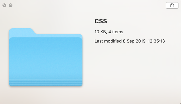
From the images above you can see that the file size is roughly 23 times smaller without using Bootstrap. This is only creating a simple single page example, now imagine the project size differnce with a multi-page website!
As shown in my tests, Bootstrap coding structure along with the core files can cause in some cases up to 23 times the file size. From a web developer’s stand point this can cause lengthy site loading times. In this example I used CSS grid as an alternative but shortcuts rarely occur without their consequences and in this case it’s browser support. Yourself and many others probably use browsers such as Chrome, Firefox, etc.. but there is still a large user base that still browse the web with IE (Internet Explorer). Unfortunately this shortcut’s consequence is the lack of support for IE and with microsoft moving away from IE, there may not be support anytime soon.
So what do you do? If you are reading this as an aspiring web developer looking for the key to crack the mystery that is CSS, Bootstrap is a brilliant starting point. It is great to help you create professional-looking websites quickly and with minimal CSS knowledge, but don’t place Bootstrap on the pedestal as the be-all and end-all. I’ve shown the increase in file size it can cause and if I’m honest your only half a web developer without core knowledge of CSS. Use Bootstrap to help increase your knowledge of the CSS properties.
<div class="container">
  <div class="row">
    <div class="col-sm">
      One column
    </div>
  </div>
</div>
Our alternative; we provide support for all browsers, this includes IE11. We use Bootstrap Grid on all our sites. It uses Bootstraps container, row and col styling without the extra baggage. This allows us to create professional websites, supporting all browsers without the spike in file size. You may have a completely different outlook on this topic and I’m very aware of more modern CSS frameworks like Materialize, but in my opinion YES! Bootstrap is still relevant.
Studio Location
Floor 2,Telephone
+44 (0)28 90 098 678
Get in touch with us today with the details below, or use the contact form to ask us a question and one of our Wibblers will get back to you.
"*" indicates required fields