Gravity forms is a leading WordPress form builder that Wibble have used for 100s of web design and web development features. Using gravity forms to the best of its ability can make a website a much more successful project.
In my previous blog post, I shared how I taught myself to build my own space online by learning about CMS and WordPress from books and videos on the web. As a web support agent and web developer, I have constantly sought opportunities to improve my WordPress skills by leveraging the numerous resources available online. However, when it comes to Gravity Forms, I have relied more on my team members for guidance.
My learning approach involves building while learning, starting with the top-level elements and working my way down the hierarchy of elements. As a kinetic learner, I prefer hands-on experience over reading, so finding a comprehensive list of elements for styling was challenging. Therefore, in this blog post, I will share the starter setup for styling forms using Gravity Forms.
Assuming that you have configured Gravity Forms and need help with styling, let’s dive straight into the main elements contained within your form tag. The .gform_wrapper class is the main container for the entire form tag.
<form>
Within the form tag, you have your .gform-body / .gform_body that houses your fields.
To style this section, you can target either the .gform-body or .gform_body, depending on your naming convention.
Here’s an example of how you can structure your CSS using the static site method or PostCSS:
Static site CSS:
form {

  /* Form container styling in here */

}

form .gform-body {

   /* Styling for the fields container goes here */

}
or PostCSS Nesting
form {

  /* Form container styling goes here */

  .gform-body {

    /* Styling for the fields container goes here */

  }

}
I prefer to keep these structures to prevent any conflicts with other fields that may have the same class names but need to be styled differently.
</form>
Once you’ve styled your form container/body, you can move on to the fields container. Generally, you don’t need to do much with .gform_fields, but let’s take a closer look at how it’s set up in the form for clarity:
Static site CSS:
form .gform-body {

  /* Styling for the fields container goes here */

}

form .gform-body .gform_fields {

  /* Styling for the fields group container goes here */

}
Or using PostCSS Nesting:
.gform-body {

  /* Styling for the fields container goes here */

  .gform_fields {

    /* Styling for the fields group container goes here. See full code at the end of this post. */

  }
}
As you dive into the fields, you’ll find a vast amount of target classes available due to the numerous features that Gravity Forms now offers. If you’re new to this, it’s a good idea to play around with the different class names in your inspector to identify which ones you’ll use for generic styling and which ones are better for more targeted styles.
For instance, the phone, email, and textarea fields are set up as a gfield that contain a <label> and an <input>. In contrast, Name or Address fields have a subset containing spans that house our <label> and <input>. Thus, you must consider this when ensuring that your inputs and labels are styled consistently.
Once you have reached the fields section, it’s important to understand that each field has its own unique class name which can be used to target and style the field, as well as its associated label, description, and other child elements.
For example, the Phone field has a class name of “email” and its associated label has a class name of “gfield_label”. So to style the label for the Email field, you can use the following CSS code:
.gform_wrapper .gfield.email .gfield_label {

    /* Your label styles here */

}
Similarly, to style the input field for the Email field, you can use the following CSS code:
.gform_wrapper .gfield.email input {

    /* Your input styles here */

}
In addition to the label and input fields, each field also has other child elements that can be targeted and styled. For example, the Name field has a child element called “ginput_complex” which contains separate input fields for the first name, last name, and other name fields.
To style the label for the first name field in the Name field, you can use the following CSS code:
.gform_wrapper .gfield.name .ginput_complex .gfield_label:nth-child(1) {

    /* Your label styles here */

}
To style the input field for the first name field in the Name field, you can use the following CSS code:
.gform_wrapper .gfield.name .ginput_complex input:nth-child(1) {

    /* Your input styles here */

}

.gform_wrapper .gfield.name .ginput_complex input:nth-child(1) {

    /* Your input styles here */

}
Similarly, to style the label and input fields for the last name and other name fields in the Name field, you can use the following CSS code:
.gform_wrapper .gfield.name .ginput_complex .gfield_label:nth-child(2) {

    /* Your label styles here */

}
.gform_wrapper .gfield.name .ginput_complex input:nth-child(2) {

    /* Your input styles here */

}
.gform_wrapper .gfield.name .ginput_complex .gfield_label:nth-child(3) {

    /* Your label styles here */

}
.gform_wrapper .gfield.name .ginput_complex input:nth-child(3) {

    /* Your input styles here */

}
It’s important to note that Gravity Forms also provides additional classes for fields based on their settings and conditions. For example, a field that is set to be required will have a class name of “gfield_contains_required”.
So if you want to style all required fields in your form, you can use the following CSS code:
.gform_wrapper .gfield.gfield_contains_required input,

.gform_wrapper .gfield.gfield_contains_required textarea {

    /* Your required field styles here */

}
Conclusion
In summary, to style a Gravity Form, it’s important to understand the structure of the form and each field’s associated classes. By using these classes, you can target and style each field, as well as its associated label, input, and other child elements. With these tips and tricks, you can create beautiful and functional forms that match your website’s style and design.
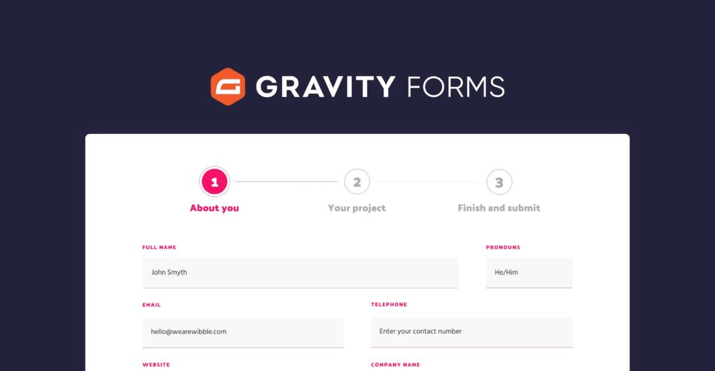
If you wish to know more about our services you can check out our other blogs or contact us on our beautifully styled form… See a demo of one of our WordPress forms below.
"*" indicates required fields
Wibble are an award-winning studio based in Belfast in Northern Ireland and we offer a range of web design services to help you with gravity forms and similar form builders but also we offer web design and web development, technical SEO, security audits, website maintenance, backup and support. If you’re interested in learning more about how we can help you optimise your WordPress website for success, get in touch or go to our start a web design project section.